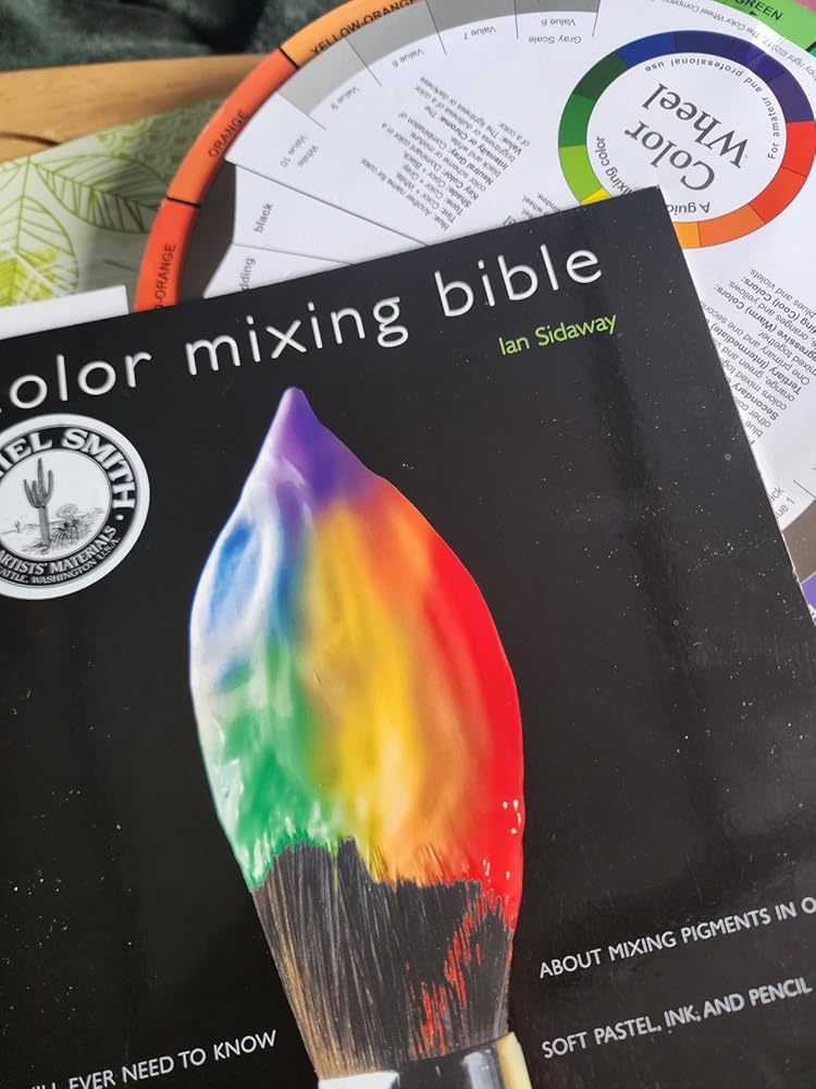

As someone who juggles between acrylics, watercolors, and ink, this book has been my holy grail. The moment I cracked it open, I realized it wasn't just another color theory book - those pigment behavior 'Watchpoints' saved me from a cadmium red disaster in my last oil painting session!
The real magic lies in the cross-medium comparisons. Last week, while teaching a workshop, I watched a pastel student gasp when they saw how ultramarine behaves differently in gouache vs. pencil form. The side-by-side mixing charts (which now live permanently on my paint-splattered studio table) make transitioning between mediums feel less like guesswork.
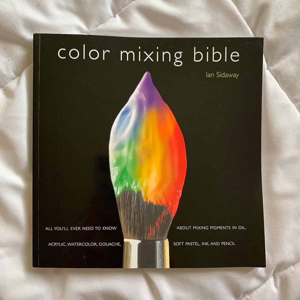
Is it perfect? Almost. I do wish there were more advanced techniques for creating specific textures - that 'muted colors' comment from another reviewer resonates with me. But when your hands are covered in phthalo blue and you need to mix the exact shade of Venetian red that's in your mind's eye? This bible delivers every single time.
Pro tip: Dog-ear the ink mixing section if you're into illustration - those ratios have transformed my comic work. And yes, the spine does eventually give out from constant use (mine looks like it survived an art school riot), but that's just proof you're using it right.